Sunday, March 13, 2011

FINAL


Where to Move for the Best Beer?
A GIS experiment in moving to Portland


Introduction


Almost every beer lover, like me, knows that Portland, Oregon holds the record for more breweries than any other city, according to The Travel Portland website. Portland has over 30 breweries within city limits, so for a beer lover like myself, this seems like a fantastic place to move. However, when moving to a new city, there are some factors that may not be apparent to a new comer. As in, where is it safest to area live? Where are there high rates of crimes? Where there any homes that I can actually afford to live in? And, most importantly, how far are these homes from breweries? That is, after all, why I wanted to move to Portland. In this GIS project, I will try and find the best place to live for a young person like myself, in the city with more breweries than any other in the United States.

Methods

In order to do the research for this project, I first located all the breweries in Portland city center through the use of various online resources, such as the Oregon Brewers Guild, and the Portland Online Beer Guide. I created an Excel file of all the reputable breweries, adding in their name as well as address. Then I was able to geocode these addresses on ArcGIS using the Street Map USA address locator. After adding the Portland street map from Street Maps USA, I plotted the geocoded addresses on the map. From here, I was able to do analysis work on the layer of breweries that I added to the map. For the housing information, I utilized various online real estate websites for Portland city area. I was able to compile a database on Excel of the homes for sale in Portland that were under $300,000. That way, it would be a more reasonable search, as well as the fact that trying to geocode every home for sale in Portland seemed like an unreasonable goal for the time allowed. With the Excel database, I was able to geocode all the $300,000 and under homes for sale and add them as a layer to the map, to later analyze.

For the crime rates, I used the Portland CrimeMapper website, from the Portland Police department. I was able to create a layer based on the different crime rates for the Portland city area. There were three classifications: low crime, medium crime, and high crime. These data were based on the crime rates of each area for the past 12 months. Using this information, I was able to analyze the homes for sale that I had geocoded to see where they were related in comparison to the medium and high crime areas, as well as how far they were in walking distance from breweries and pubs.

Results
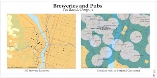

This first map above shows brewery locations in the Portland city center. If moving to Portland, this would be the place to live for beer. As it can be seen, there are a large amount of breweries and pubs in this area. The buffers around each brewery or pub shows how far it is logical to walk to each place. From this view, it is easy to see where the most breweries are located. They are centered on the west side of the Williamette river, which runs right through the middle of the Portland City area. So far, the area looks promising, there are lots of breweries as expected, so there should be plenty of homes for sale that are under $300,000.
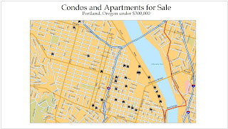
There are quite a few homes for sale in the Portland city area that are available under $300,000. However, which one to choose? Or, perhaps the home sells before I make an offer. Where should I look to find another perfect house? First of all, the home should be in a safe location. According to the Portland Crime Bureau, these are the crime rates in the area, based on the number of overall crimes in the last 12 months.


This gives a good indication of neighborhoods, where, as a woman, I probably should avoid living in. Based on this information, I can eliminate some homes for sale. Using the "Select by Location tool", I chose the homes which were contained by the "High Crime Ra
te" and "Medium Crime Rate" zones. The "Low Crime Rate" was pervasive throughout the city, and could not be avoided. I also compared the homes and their distance from the breweries and pubs in the city center. Luckily, all the homes under $300,000 were within the limit of 1/2 mile from any brewery or pub. None were eliminated because of this, but there were certainly some homes that were closer than others to many breweries.
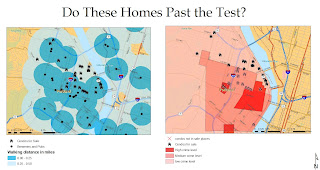

Based on this information, some homes were eliminated because they were in areas with more crimes than acceptable.
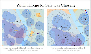
Lastly, in the above map, there are the results of the combination of all factors that were analyzed in the process. The homes in the right hand map, closest to the river, were eliminated based on the fact that they were very close to a high crime area, versus the other homes away from the river, which were not near a high crime zone, yet still within the buffer of breweries and pubs. Preference was given to the homes for sale that were in the darker blue buffer area of breweries and pubs, which meant that they were only a quarter mile away, a very walkable distance. After all this analysis, I chose the home at 2080 Overton Street as the best place. It is located within the quarter mile buffer from A few breweries, as well as the half mile buffer of many other breweries as well. Additionally, there is not need to enter into any areas of high crime while walking home.

Conclusion
Through the use of ArcGIS and the analysis of geocoded point and areas, I was able to find the perfect place to live in Portland to have the best access to good beer in the United States. Additionally, since I am probably not moving to Portland right away, the home that I found for sale will most likely have been sold by the time I get there. However, after completing this assignment, I am much more familiar with the Portland area, and thus using the information acquired in this exercise, I will be able to easily asses other homes for sale based on their location. Also, the map could serve as a guide for other people moving to Portland, who also would like to be close to nightlife, breweries, but also would like to stay out of the areas with high crime rates. Thus, this map can be helpful to all kinds of people who have an interest in moving to this unique area. A more lofty project goal, of course, could also be to include all the best restaurants in Portland, since I do love food as well. Additionally, since I love cooking, it could be useful to add in good organic farmers markets, as well as specialty food shops. This way, the guide would be more comprehensive in all aspects. However, I felt that this was a good way to get to know the various areas of Portland, even though I have never been there. Overall, I found that my experience gained in this class was extremely useful, and I hope that I will be able to use all I learned about GIS in the future.

Tuesday, March 1, 2011

week 8 lab

For week 8, we had to create two different sets of three maps for LADWP. These were to show the precipitation in Los Angeles County for this season so far, the season average, and then the difference between the seasons:
here is the first set, using Kriging


here is the next section, using IDW:


It appears as though there have been some differences in the changing amounts of rainfall in Los Angeles county. Some of the areas have more rainfall this season than in the past, while other stations have been reporting less rainfall than usual. Although the rainy season is not over yet, there were quite a few areas that were reporting quite a bit more rainfall than usual. For example, the station in Tanbark reported 16.05 more inches of rain this season than for the average season. Additionally, there were also some places that reported less rainfall than they usually got as well. The Topanga canyon control station usually reports getting 5.5 or so more inches of rain per season.

I think that this overall shift towards a lot of rain, versus, normal seasonal precipitation, could be a result of the cooler temperatures that come with climate change. Even though some parts of the world are heating up, of course, there are some areas that are receiving more and more intense weather. Even though these small shifts in the Los Angeles area do not prove anything, there are some differences between this year and the normal rate for Los Angeles which probably should be kept track of. There are some areas, of course, which have less rain than other parts of Los Angeles, so perhaps the rain is just shifting in the areas in which it is the most intense.

I think that the more effective way to map this, at least for the rain project, was the kriging form. For some reason, I thought that it was more detailed than the IDW way of making the raster model, although perhaps the parameters of the IDW model just had to be adjusted. However, I really thought that there would be more difference between the ways of making the raster models. I think perhaps the ArcGIS guide maybe exaggerated the differences between the models for effect, as they did not seem that different until I did the model of the difference between the rainfall time periods. In the difference between "normal" and this season so far, the two different models seemed a little bit more different than they did in the other maps. Overall, I though this was a valuable project, however, because I think the ability to create such types of maps is very valuable in the GIS field.

Wednesday, February 23, 2011

lab week 7


This week we had to create a fire demographics map for the Station Fire which occurred a few years ago. This map was not too difficult to make, the main challenge was finding the information. At first, I had no idea where to look for the DEM, as it seemed that most of the websites that had DEM's made you pay for them. I am assuming these are probably very high quality, and therefore you have to pay to be able to use them. However, I finally found some information on the USGS Seamless viewer, which was very helpful. I also found some information on California's FRAP website, which is the forestry department for the entire state of California. With their information on the entire state, I was able to find just enough information on the Station Fire area, and pare it down.
When working on the tutorial part of the map, I found that what I learned came in handy when creating my own map. Of course, the tutorial was much more detailed than my own map, seeing as I did not have as much detailed information on what the specific plants and vegetation types were in the area. Although, being very familiar with the area where the Station Fire occurred, it makes sense that the area burned, as there is a lot of extremely dry vegetation there most of the time. I think though, that it would have been helpful for me to have had information over time on the fuel load of the vegetation. I think that it could also be an interesting map to do, the way the fire fuel load changes over time, during the year and even year to year.
The map that I created, I wish that I had more time to add more detail to the map that they included in the tutorial, such as the historic fires, and other information that can help a fire fighter plan where new fires might occur, and what they can do to help this. I think that the biggest challenge that I had in creating this map was what little knowledge I have, when looking at the vegetation maps, what means some sort of vegetation will be a large hazard, and what types will not. Some of this information was included in the vegetation grids that I was able to find online from the FRAP website, but I was not one hundred percent sure that it was correct.

Tuesday, February 15, 2011

Wednesday, February 2, 2011

week 5: QUIZ


Brief
Based on the high rate of marijuana dispensaries that have opened recently, I believe that the new ordinance by the LA city council is a good measure to protect children. It is not the fact that the dispensaries are necessarily bad for children to be near, but it often is the case that there are some less than desirable people that tend to congregate near these places. Therefore, this map shows areas where children frequently go to school, play, or hang out at, per the city council's orders. There is to be a buffer of 1,000 feet from these areas, which I have also included on the map.

The second map shows the Hollywood area specifically, where there happen to be a lot of dispensaries which overlap with schools, some right next to each other in fact. Under the new ordinance, this would no longer be able to occur. This I view as a good measure, as the areas where there are a lot of young people should probably not be directly next to marijuana clubs and dispensaries.

Tuesday, February 1, 2011

Wednesday, January 26, 2011

week 3 lab


This week I decided to do my map on the best vegetarian-friendly neighborhoods to live in West LA. What I found was, that without a doubt, it is Santa Monica. And not just anywhere in Santa Monica, but the area between Santa Monica blvd and Broadway, west of Bundy ave. As a vegetarian, I was not really surprised to find out this information, as some of my favorite restaurants, grocery stores, and farmer's markets are in this area.

I got my data for the map by looking up all the farmers markets in West LA first. I thought that these were usually a good indication of vegetarian friendly neighborhoods. Next, I plotted stores like Whole Foods and Co-Opportunity, which are different foods that make it easy to be a vegetarian, as well as sell fresh, organic produce. Then I added in restaurants that are specifically vegetarian or vegan, although more and more today there are a great many vegetarian options available at most restaurants. After putting these on an excel sheet, I added the information to the map. However, I first had to make an address locator. I did this by downloading a TIGER file of all the streets in LA, from the CALTRANS website. Then I told ArcGIS to use this layer as the base for the address locator, which it was able to. Then, I just used the geocoding option on ArcGIS to upload and find all my addresses. Then, I was able to label each of my places based on the name of the place, which I had added to the Excel file in a field called "type".

I will say that there is a very large benefit to using ArcGIS to geocode addresses, as it makes it so simple to upload them once you have made an address locator. Then, it is also very easy to label them and everything. There is a learning curve in getting to know how to work with the program, especially in making the address locator, but it wasn't impossible to figure out.